I recently decided that my personal site needed a tune up. No longer happy with the current design, I decided to throw it away completely and to start from scratch. Here are a few things I thought about during the process of re-writing the website.
Choosing a backend
Right off the bat, I knew that I wanted to continue using a static site generator for my homepage. Tools like WordPress and Ghost are interesting but for my use case I found both to be overkill. After taking a look at some of the most popular static site generators1 around and playing around with them, I had a better idea of the current tool landscape at the time.
There are a bunch of static site generators these days written in a variety of languages. I took a look at a few JavaScript-based ones, such as Hexo and Metalsmith - both on opposite sides of the feature list spectrum. Metalsmith is completely barebones to the point where all functionality is added via plugins. This is a pretty neat idea but I was looking for something that was more balanced between features and do-it-yourself mentality. When I was initially researching static site generators, Metalsmith had a lot of issues with plugin version rot as well. The idea of everything being a plugin is pretty neat - as long as these individual plugins are maintained! On the other end of the feature spectrum, Hexo reminds me a lot of Jekyll but written in JavaScript and more of an emphasis on blogs. This wasn’t enough to pull me away from Jekyll, a tool I already knew.
On the Ruby end, I took a look at Middleman and Jekyll. Middleman is a great competitor for Jekyll with some neat features. It allows for incremental building of your site, a feature that Jekyll will be lacking until its v3 release. I have not had much of an issue with build times with Jekyll but I can see how a huge site with thousands of pages would not scale well without incremental builds. Middleman also offers more in the way of a default template and such. However, in the end I stuck with Jekyll. Recent additions to Jekyll such as collections make building non-blog and hybrid websites with Jekyll much easier.
Choosing a colour palette
I am not a designer - I think the previous designs of my site show as much. As much as I wish I did, I just don’t have the eye for colour. Working with designers in the past always blew my mind as to how easy it came to them. I know I could take the time to learn colour theory (and perhaps I will someday) but at the time I was more focused on redesigning my site quickly, not leisurely learning something new. This made the simple task of choosing a colour palette a long and tedious process. There are a few tools available to help one come up with a colour palette, such as Paletton or Adobe Color CC, formerly Kuler. After fiddling for them for a few days on and off and having no success, I decided just to choose a colour I liked: blue. Once I had a colour chosen for the header, I was able to build the rest of the site off of that.
While I’m pleased with how the header turned out, I still feel as if the rest of the site can possibly use a splash of colour here or there just to make things a bit more appealing. I couldn’t really see any place to fit these accent colours in a way that felt natural. This will probably be something that will to be iterated on over time.
The Holy Grail that is Flexbox
Flexbox is the best thing to happen to CSS. I’ll scream it from the mountain tops if needed because it’s true. As long as the only browsers your site needs to support are IE11+ or an evergreen browser, you can (mostly2) say goodbye to hacky CSS rules to position elements on a web page.
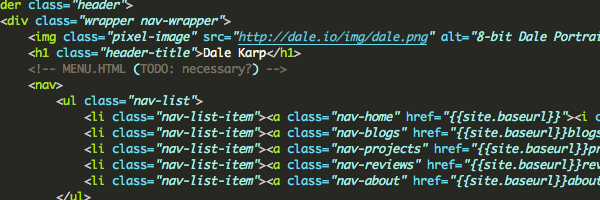
The great thing about Flexbox is that it’s flexible (yet another surprise!) and will adjust its size across different screen sizes if the developer desires it. For example, the page header makes use of flexbox to make sure it looks great on both large and small screens. All I need to do to get my header to scale the way I wish is use the following CSS rules on the wrapper for my header block:
.nav-wrapper {
    display: flex;
    justify-content: center;
    align-items: center;
}
This sets the wrapper rendering box style to flexbox and centers all the elements along both axis. When the screen width is below a certain size, we can use the following rules to change the direction of the main axis from a row to a reversed column so each header element has room to breath and appears in the proper order:
@media screen only and (max-width: 600px) {
    .nav-wrapper {
        flex-direction: column-reverse;
        align-items: stretch;
    }
}
I’m using a few more rules to align individual items, but that is the basics of it. Flexbox has enabled me to re-arrange the entire site with just a few CSS rules and I think that is awesome. I’m using it for any part of my page that requires even a tiny bit of element positioning and it’s been very easy to both learn and use. Offloading a lot of the grunt work to the browser while providing a fewer set of CSS rules was definitely a smart move, and I’m excited to see what further revisions to the spec bring.
Consistency between old and new
In the redesign, I decided to make better use of header tags to denote subheading rather than bolded text. Unfortunately, a few of my older blog posts made liberal use of the old and bold way. I took this opportunity to flex my bash and regex muscles and see if I can come up with an elegant way to fix this in one swing.
My first step was to construct a regular expression that would find all the old headers. The old headers took the form of bold text which, in Markdown, meant the text was surrounded by two asterisks on each end. The header would be the only string of text on the line. With this information, I came up with the following regular expression and used it to find all headers in my _posts folder:
git grep '^\*\*.*\*\*$'This regular expression looks for any length of characters in between two literal asterisks that bookend the entire line. After testing that the regex worked, I used a combination of the find and sed commands to do a massive search and replace with the following command:
find _posts -type f -exec sed -i '' 's/^\*\*\(.*\)\*\*$/\#\#\# \1/g' {} \;The above command looks for files in the _post directory, and for each file runs a sed command asking it to edit files in-place without a backup3. The regular expression now creates a group around the header text so we can use it in the replace with the proper symbol denoting an h3 tag: three literal pound characters. Now all blog posts with headers will conform to the new style.
Design & organization choices
Aside from choosing site colours, I spent the most time thinking about how I wanted to layout my website. My previous v3 design was bland and didn’t make the best use of available space. I spent a lot of time looking at other Jekyll blogs for some inspiration but I found many of them to be overly busy or overly minimalistic. I would draw layout after layout on paper until I came to the one you see now. Moving the persistent navigation block from the side to the top allows me to take advantage of all the below space: this comes in handy when scaling the site to work on multiple resolutions.
Since the beginning of 2015, I’ve been writing reviews on the games I have finished for fun. After deciding to add these reviews to the site. As of the launch of the redesign, only one of the eight reviews I have written are published but I’ll be editing the others and getting them online shortly. Right now, they are a separate entity from the other blog posts and I’m not sure if this was the best idea. This home page is a place for me to talk about what I love doing. For the past few years, this has solely been about programming. I’d like to expand that to writing about other subjects but dividing posts up into ‘blogs’ and ‘reviews’ may limit myself in the future. I could (and probably will) just treat everything as a blog and use tags or categories to group the related info. Design choices like this are what I spent the most time on during this redesign. Implementing the ideas I come up with are no problem but deciding whether I’m making the right choice on certain decisions is an area where working on a team definitely benefits.
There are a bunch of other small but useful additions I’ve made. If you haven’t noticed, I tend to go off on tangent mid-paragraph. Making use of footnotes allows me to do this without breaking up the flow of content, and the Kramdown markdown renderer used by Jekykll makes usage of footnotes very easy. Some posts can have a header image, such as this one. If you’re reading this on a small device, you may not see it - I’m currently thinking of a good way to display the header image without making all of the above-the-fold content on a mobile device nothing but headers. Most of the small additions are there to make writing content easier for me and for said content to display correctly, no matter the screen scale.
In the end
I’m pretty happy with the layout I ended up with. I find easier on the eyes than previous designs. Standing here with the project finished, I already have a list of things I’m no longer happy with and will work on for the next iteration. Personal projects like home page redesigns give me an opportunity to experiment and play but if I don’t limit myself and consider the project ‘finished’, I’ll never release it. Do you have any suggestions about the design? Love it? Hate it? Let me know in the comments!